Building a Menu Component in Power Apps

We’ve done a fair bit of set up, ensuring we’re sticking to wider Power Platform architecture principals first. With our environments, variables and ERD done, it’s time to get building – the fun part! An easy thing for us to start with is building a simple menu component for our app. 

In Power Apps, components are reusable pieces of functionality. The idea is we build things once rather than lots of times, then add that piece of functionality to multiple screens. Examples of use cases for components in a canvas app would be a header, footer or navigation menu – content that will appear on every screen throughout your app.

If you’re reading this and are a newcomer to low code development, you may not realise that some practices and sayings have made it across from traditional software development. One of them is one of my favourites and I enjoy any opportunity to roll it out.

WET vs DRY

This is the concept of ‘WET’ code and ‘DRY’ code.

WET stands for Write Everything Twice – by that we mean writing the same code, that does the same job, over and over again. This approach is much harder to maintain as any changes need to be done in multiple places.

DRY stands for Don’t Repeat Yourself – by that we mean only write it once and use it multiple times. Any changes are done to the 1 single version and are instantly cascaded to anywhere else using that functionality.

I was first introduced to this saying in 2018 and it’s stuck with me since. The friend who said it took a look at one of my earlier Power Apps and, in no uncertain terms, told me that it was “absolutely dripping!”. At the time I would write ‘WET’ code first to make sure it works, then try to remember to go and make it ‘DRY’ later on. I’d usually forget. Obviously with experience comes the knowledge to try and build ‘DRY-first’. 

Thankfully, that’s very easy for us to achieve in Power Apps as there are lots of common use cases.

Component types

Before we start building our menu component, I’ll just touch base quickly with the 3 main component ‘types’. This is more just by way of introduction, I’ll be giving these more air time in future articles.

Power Apps component framework (PCF)

Power Apps components are easy for low code makers to build repeating functionality, with little effort or time. However, if you wish to delve into pro-code and fully extend capabilities of both model-driven and canvas apps, the Power Apps component framework is where you’ll want to be.

Component libraries

If you need to reuse the same functionalities across multiple apps, we’d typically build these in component libraries. You can then add components built in these libraries to any other canvas app or custom page, as long as they’re in the same Power Platform environment. Component libraries are solution-aware too, so a best practice is to create them within solutions and wrap up as part of any ALM processes.

In-app components

The focus of this article – building a component directly within our canvas app. We don’t need to use the components in any other apps, but we also want to ensure our app stays DRY.

The requirement

My wife loves scrolling through the mobile versions of Instagram and Facebook, so she’s very used to having app navigation at the bottom of the screen. Most of us will be used to this across other social media apps we use on smartphones:

So it makes sense for her to request this for the business app too. Happy days.

We’re also building this purely for use on a smartphone. We’re therefore creating a blank app for phone, all related articles from this point will be assuming this too:

The build

To start building a menu component, we’ll need to open our canvas app in ‘Edit’ mode. We can then access the Components option to create our repeating functionality.

Initial setup

Before the component, an heads up that colours and font size/settings for the app are driven by a global variable that’s set in the OnStart property of the app. I’ll be referring to this variable for certain settings throughout this article. 

If you’ll be following along, add this Power Fx to the OnStart property: The settings here are as per the wife’s selection, we are using these in the app otherwise she’ll divorce me:

				
					Set(
    gvConfig,
    {
        Background: ColorValue("#FFFCF7"),
        Primary: ColorValue("#2B6B31"),
        LogoBase: ColorValue("#C4EBD4"),
        Negative: ColorValue("#CD5C5C"),
        FontText: Font.Lato,
        FontHeader: Font.'Lato Black',
        FontSizeDefault: 16,
        FontSizeHeader: 20
    }
)


Next, from the Tree view, select Components then New component. Give the component a unique name that also describes the component purpose, in our example that’s cmpNavMenu:

Personally, I’ve always got into the habit of prefixing my component names with cmp. I like good naming conventions for things, it’s good practice.

I have a menu collection built in the app’s OnStart property. To access that collection in the component, a setting needs to be enabled. On the right hand side, switch Access app scope to On:

For reference, this is our collection build for the navigation menu. Add it to the OnStart of your app; either add the screens mentioned or update with 4 screen names you already have:

				
					ClearCollect(
    colNavigation,
    {
        OptionText: "Today",
        OptionID: 1,
        OptionScreen: 'Appointment Screen',
        OptionIcon: Icon.Waypoint
    },
    {
        OptionText: "Calendar",
        OptionID: 2,
        OptionScreen: 'Calendar Screen',
        OptionIcon: Icon.CalendarBlank
    },
    {
        OptionText: "Clients",
        OptionID: 3,
        OptionScreen: 'Client Screen',
        OptionIcon: Icon.People
    },
    {
        OptionText: "Treatments",
        OptionID: 4,
        OptionScreen: 'Treatment Screen',
        OptionIcon: Icon.ListWatchlistRemind
    }
)


OptionText is what will be displayed to show what the option is, whilst OptionID just acts as a sorting mechanism if we need it. I’ve found in my experience in working for clients, this is a useful thing to have in menu collections when they want the order changing.

The OptionScreen property will be where we’re navigated to when selecting the item. Finally, OptionIcon contains out-of-the-box icons available to us in Power Apps. 

My preference for icons is to use PowerPoint. I find the ones in Power Apps a bit limited, so a good trick is to find good ones in PowerPoint and save them as SVG files. You can then open them in a code editor of choice to get the code, to then use in your canvas app. However, I didn’t want to blow the wife’s brain so early, so we’re sticking to the out-of-the-box Power Apps icons for now!

Finally, I want to adjust the size of the component ‘real estate’. I’ll keep 640 for my width as that’s the default for a mobile-based canvas app anyway, but change the height to 100:

Custom property

Whilst built in canvas apps, in-app components are separate living creatures. If we want the app and the components to talk to each other, we create and configure custom properties. For our menu component, we want an input property, which is used to take values from our app, into our component.

With the component selected, click on New custom property. Fill in the required fields to your requirements. Again, I tend to prefix the ‘Name’ with ‘cpi’ for Input properties and ‘cpo’ for Output ones. In our scenario, we just need a text property:

You’ll know this has worked as, with the component selected, you’ll see your created property via the properties dropdown in the top left:

This is another reason why I prefix the name field with cpi or cpo; if my component has lots of custom properties, it’ll show them in alphabetical order. That’s probably just my brain and liking structure and order.

Menu options

Add a Blank Horizontal Gallery from the Insert menu:
Adding a blank horizontal gallery to Power Apps

When the Select a data source pane appears, select the menu collection previously created in OnStart:
Adding a menu as the Items property for a gallery

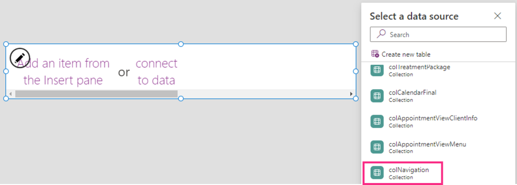
Update the following gallery properties:

Property Value
Height
Parent.Height
Width
Parent.Width
Template padding
Template size
Parent.Width / CountRows(colNavigation)

For the Template Size property, we’re taking the overall width of the component and dividing it by the number of entries in our navigation collection. This should give us even sizing.

Add a Label to the gallery. Update the following label properties:

Property Value
Font
gvConfig.FontText
Font size
gvConfig.FontSizeDefault
Height
30
Text
ThisItem.OptionText
Text alignment
Align center
Width
Parent.TemplateWidth
X
Y
70

Finally for our label, she’d like the font weight to be stronger if the screen she’s on relates to the presented option. We can do this by comparing the OptionText value in our collection (ie Today, Calendar) with whatever text is added to our cpiActiveScreenText input property. This is the formula for the FontWeight property of the label:

				
					If(
    ThisItem.OptionText = cmpNavMenu.cpiActiveScreenText,
    FontWeight.Semibold,
    FontWeight.Normal
)


Let’s test this quickly. Access the components cpiActiveScreenText input property and update the text to ‘Today’:

Menu icons

We’ve already stored the icons for each option in our collection, so let’s add them to our menu gallery.

Click on the gallery and click the pencil icon to ensure it’s in edit mode. From the Insert menu, search for icon and select whichever one you like. We’re going to update it in a moment, but we need a placeholder first:

With the icon in place, select it in the gallery and update the following properties:

Property Value
Color
gvConfig.Primary
Height
40
Icon
ThisItem.OptionIcon
Width
40
X
60
Y
30

We should have something close to this:
Example of a menu component in Power Apps

Selected indicator

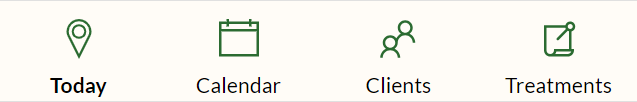
We both thought it was a good idea to have an additional indicator for a selected item, we can do this a number of different ways in canvas apps. The wife wanted something like Facebook, where a coloured line appears above the selected item. Easy peasy.

With the gallery selected, go to Insert and select Rectangle:

The rectangle will cover most of the box, that’s ok. It just needs some tweaking, which can be done by changing some property values. With the rectangle selected, update the following:

Property Value
Color
gvConfig.Primary
DisplayMode
DisplayMode.View
Height
3
Width
75
X
42
Y

We should now have something like this:
Example of a menu component in Power Apps

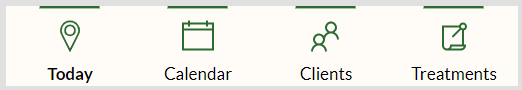
All that’s left to do now is update the Visible property of the rectangle. We only want it to show when the related option is selected. This will be a very similar formula to how we set the FontWeight of the label control earlier in this article.

With the Rectangle selected, navigate to the Visible property and update with the following Power Fx:

				
					ThisItem.OptionText = cmpNavMenu.cpiActiveScreenText


Visually, the component is now done.

Navigating

Finally, we need the canvas app to navigate to the screen related to the selected item. We have the screen name stored in our collection for this very purpose.

With the gallery selected, navigate to the OnSelect property and update with the following Power Fx:

				
					Navigate(ThisItem.OptionScreen)


Awesome, we’re done. Time to add it to our screens so we can test.

Deploy and test

With our menu component built, we need to add this repeating bit of functionality to all screens in our app that need it.

Select one of the screens that needs the component. From the Insert menu option, expand Custom and click on the component:

With the component selected, access the cpiActiveScreenText custom property. For the selected screen, update the property text to match the relevant OptionText value in the menu collection:

Repeat the same process for all other screens. Once done, put the app into Play mode and select different options. The rectangle and label font weight should change according to the selected option and screen:

There are many ways to build menu components for your canvas apps. I’ve built many with increased levels of complexity in the past, they’ll get their own articles in future as they were pretty cool!

For now, my wife doesn’t need anything over-complicated so this quick and easy menu component build is perfect.

What do you think?

Your email address will not be published. Required fields are marked *

4 Comments
  • Richard Duffy
    July 4, 2023

    Love this blog!

    Another great article, nicely explained and easy to follow.

  • Douglas
    July 4, 2023

    I built along just to see how you go about yours and learn a few things along the way and I sure did. Thanks for sharing and looking forward to the next series.

    • Craig White
      July 4, 2023

      Thanks Douglas, appreciate the feedback as always. This was my first shot at an instructional ‘follow along’ type article, so good that you were able to take the article & turn it into a build!